They claim that they aspire to not only impact commerce, but also culture.
http://www.wink-mpls.com/company.php
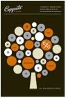
Considering their often large, corporate clients, Wink’s design aesthetic has an unexpectedly handmade, retro feel, drawing influence from past designers such as Paul Rand, Saul Bass, Tibor Kalman, Eberto Carboni, Max Huber, Eames and Alvin Lustig to name a few.
http://grainedit.com/2008/01/30/wink-design-interview/

Rebel Green is a new aesthetically conscious and eco-friendly company with products aimed at reducing and reusing. Their fruit and vege clean removes chemicals and waxes, has not been tested on animals, is natural and biodegradable and a portion of all profits goes towards clean water initiatives and fighting hunger.
http://www.rebelgreen.com/home.html

I love the retro illustration and typographic work on this product–the logo is Buffet Script which I adore. It is inspired by 1950s packaging, which takes us back to a simpler and more wholesome time. We can own this product and feel nostalgic for an era that we were never a part of whilst simultaneously feeling smug about our eco choices!
More Rebel Green products designed by Wink include these organic bags:-


Some other Retro designs from Wink…….


A new trend has been coined by trendwatching.com – a leading trend firm - ECO-ICONIC, meaning "Eco-friendly goods and services sporting bold, iconic markers and design, helping their eco-conscious owners show off their eco-credentials to their peers. < > many consumers are eager to flaunt their green behaviour and possessions because there are now millions of other consumers who are actually impressed by green lifestyles.”
http://www.trendwatching.com/trends/ecoiconic.htm
This can be seen in much product and brand design at the moment, with clients wishing to flaunt environmentally friendly ethics whilst promoting a fun version of 'wholesome'.
Another example of a company moving towards eco-friendly packaging in a retro style is Crepini Café
Before….. After

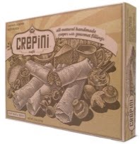
Miller Creative updated the packaging and branding for Crepini Café using natural kraft paper, minimal ink and a handmade vintage/ retro design. The redesign landed Crepini in national gourmet food chains and earned them two SOFI Silver Awards.
http://www.yaelmiller.com/index.php?/packaginghealthbeauty/crepini/
Another company moving towards eco-friendly packaging in a retro style is Schwinn Bicycles
Before….. After


Capsule recently redesigned packaging for Schwinn with recycled packaging, reduced production footprints and a classically American, nostalgic feel.
http://www.capsule.us/
I really like these designs
ReplyDeleteGreat stuff. Excellent case study, I like the before and after examples in particular.
ReplyDeletesuch good examples, every thing old is new again!
ReplyDelete