“Thomas L’Excellent analysis’s what’s behind designing alphabets in colours. A prerequisite in composition, colour is shown here to have structuring ability besides its role in decoration. Colouring and lettering are staples of everyday life, yet it seems that their two worlds are keen to stay independent, never sharing their respective qualities.”
In L’Excellents case study he outlines that generally type designers believe that colour in the typeface is not a necessity and that the letters are there to simply function and for them to do that they must be drawn in black and white, for the strongest possible contrast with its substrate.
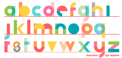
With examples using Decorative Colour, Geometrising Colour and Sructured Colour, L’Excellent shows that colour is no longer only something that a graphic designer adds to a work (previously conceived by a type designer), but maximised using multiple colours in a typeface at the early stage of the creative process.
“Colour has been ubiquitous in the history of mankind since the first huntergatherers, tens of thousands of years ago. The peoples of ancient times - the Greeks, Egyptians, Romans, Chinese, Aztecs - as well as today's artists, architects, photographers, fash ion designers and graphic designers show a remarkable enthusiasm for coloured creations, but type designers have stayed on the sidelines. Only a few - who sometimes are more graphic designers than they are typographers - have ventured to create alphabets in several colours.”
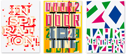
DECORATIVE COLOUR & GEOMETRISING COLOUR
The design above left by the designer Julia Tabakhova pushes the decorative colour to the max, she developed it using forms from her clients work. This polychromatic typeface uses a common face enriched by different layers of decoration. Even though the effects are decorative they begin to explore the structure of the letter. Some fonts incorporate colour as a structural element which allows it to form as a letter building principle.
“Geometric grids, matrices, modules and forms all offer possibilities for standardised assemblies that will help these alphabet designers to incorporate colour more easily. Letter shapes are reduced to their main characteristics, with colour thus given a decisive role.” As shown in the design above right.
“Geometric grids, matrices, modules and forms all offer possibilities for standardised assemblies that will help these alphabet designers to incorporate colour more easily. Letter shapes are reduced to their main characteristics, with colour thus given a decisive role.” As shown in the design above right.
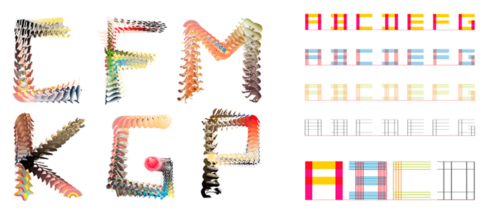
STRUCTURAL COLOUR
The unconventional look of this alphabetic type is created using two or three colours and dissembling the letters into those different coloured parts. The distinctive features of each letter are visible due to the overlays and cut-outs of the colours.
“Opening up the type world to colour is the consequence of technological evolutions that have radically altered trades involved in the graphic-design production chain. On the one hand, multicolour printing has become a common option and its cost has fallen considerably; on the other hand, IT tools, which are now accessible to any visual designer (amateurs and professionals), have become established by greatly simplifying creative activity and the practise of the graphic arts.”
http://typo.thomaslexcellent.com/avant-propos/
http://www.icograda.org/feature/current/articles1831.htm
http://en.wikipedia.org/wiki/File:Caslon-schriftmusterblatt.jpeg
http://www.peterbilak.com/
A really interesting topic Emily.
ReplyDeleteThere is a problem with the images,
try reloading them...
I am keen to see the examples you have discussed.
Other than that, you are right on track.
A great start!
i found it interesting also and the images will really enhance the blog - i'll check back to see them cause this is a great topic :)
ReplyDeletewoops sorry guys, im a bit rusty using the blogger. i think i have fixed it up now tho :)
ReplyDeleteWell done Emily!
ReplyDeleteExcellent stuff.
such good colour!
ReplyDelete